Day 019 - Controls, part 1
Lesson 3.3 (Page 157) looks at the many different controls available in WinDev. There are regular additions to this list; WinDev 17 added the following new controls:
- org chart
- ribbon
- rating
- drop down button
- funnel chart
As of WinDev 17 there are more than 40 control types. Standard controls include:
- static
- edit
- button
- image
- click area
- radio button
- check box
- list box
- combo box
- list view
- table
- looper
- treeview table
- tree view
- progress bar
- chart
Static controls
Static controls are display-only. Supported features include multi-line display, RTF, display masks (e.g. numeric, currency, date, time etc), animation (flashing, scrolling), and shadows/shading.
You assign to a static control using the control's label.
STC_SomeDisplayField = 'new value
and you read the value by assigning the control's label to a string or other variable.
You can also access the control's properties using the .. syntax.
I'm going to skip over a lot of the properties/attributes you'd expect to see, such as font, size, etc. Instead I'll just pick out what I think are items of special interest.
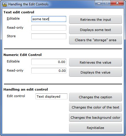
Edit controls
Edit controls can be plain text, multi-line text, RTF, HTML or password. They can also be marked as read-only or grayed (which is also read-only). You can also choose how to use the tab key in multi-line controls (whether to exit the field or insert a tab).
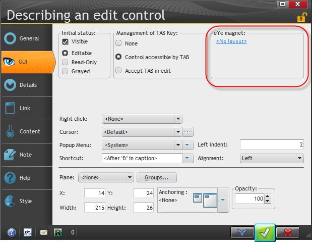
Here's the default highlighting for a control.
But you can also set an "eye magnet", which adds visual validation cue.
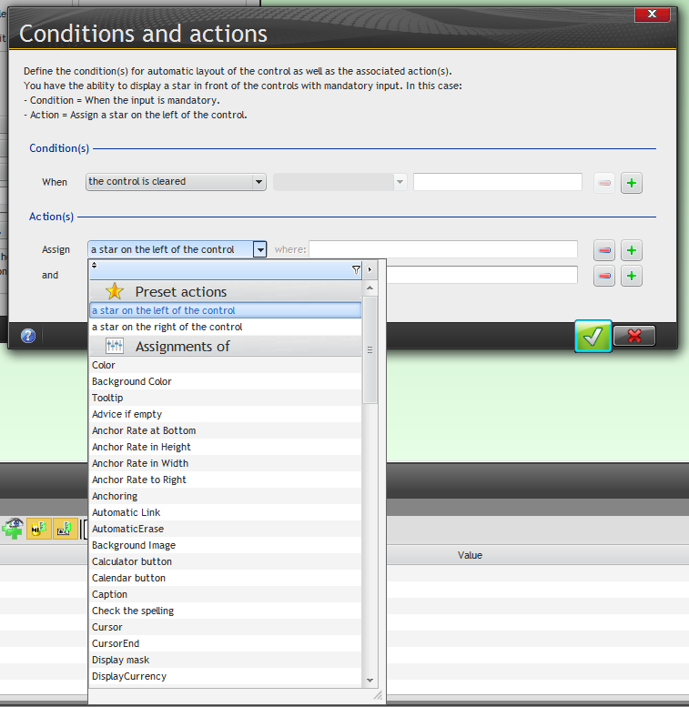
You can set the condition for the eye magnet:
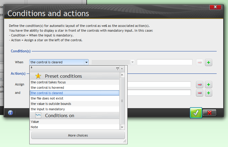
And once you've decided on the condition, you have a laundry list of things you can do to the control, including marking it with a star on the left or the right.
Tooltips and right-click options can also be set.
Spell checking relies on Open Office and its dictionaries being installed on the client computer.
Entry fields can also remember the previously entered values.
You can also have a control return NULL if it is empty instead of a zero or an empty string.
Button controls
There are five different kinds of buttons:
- normal
- validation
- interruption
- cancel
- help
Normal buttons are not intended to be used in windows that have edit controls, according to the docs. I'm not 100% sure what that means, although I think the idea is that if you have a window that's used for any kind of data editing you should be using one of the following three buttons instead.
Validation button
The Validation button is also triggered by the Enter key on a window, and you must use a validation button on any window that does data entry. This button will trigger the exit code of whatever control has focus.
Interruption button
When you want to call another window from the current window, you need to use an interruption button. If you're in an entry field when you press an interruption button, the entry field's completion code does not execute, and when the code called by the interruption button completes you're back in the entry field again. The Help button is an interruption button.
Cancel button
This button does not run validation code for whatever control has input. It is used to exit windows.
Help button
As mentioned, this is a kind of interruption button that brings up application help.
All of this brings up some interesting points about event handling in WinDev. Presumably a validation button triggers completion code not just for the control with input focus but also for all controls, so that any invalid data is detected. And if you use a regular button to close a window, you will probably only get completion for whichever fields you've actually gone through.
As with almost everything in WinDev, there are a lots of ways to configure buttons. You can set a timer on a button so it executes after a certain amount of idle time. You can also set animation as well as choose from various button images. Here's the image catalog:
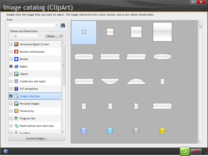
You can add your own images to the image catalog.
Image controls
Images can be static or animated. It's easy to overuse animated images; just think how annoying animated ads can be at times. But animation can be a helpful feature at times. Depending on the images used you can also control the animation rate.
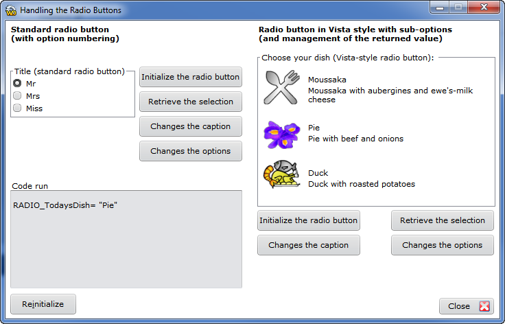
Radio buttons
Radio buttons can use images if desired.
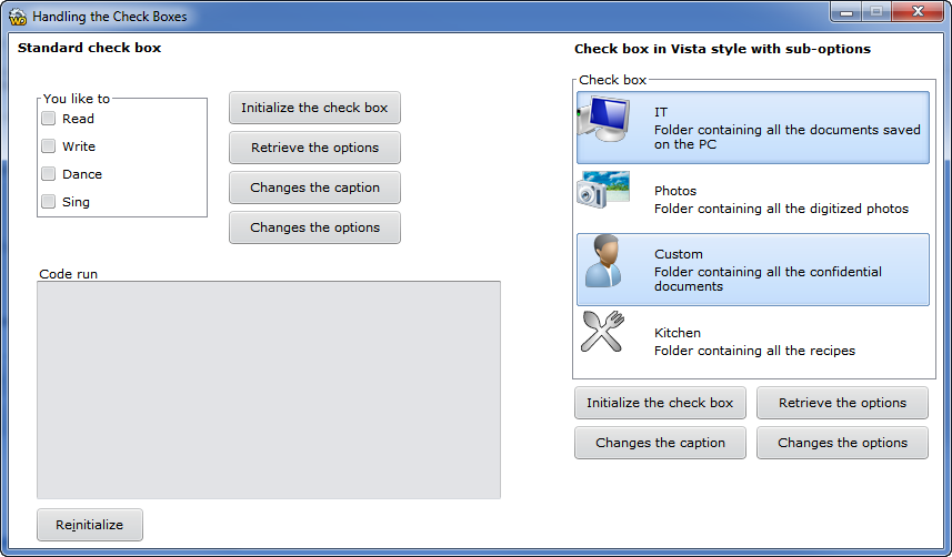
Check boxes
Check boxes can have an image, a caption, and a sub-caption. In this image I've selected two Visa style checkboxes with sub-captions.
I'll continue with the list box control tomorrow.